

Decorating a baby’s nursery is exciting but also challenging for every parent. One of the most crucial decisions to make while preparing your baby’s room is to choose the ideal color. The selected color will define the nursery’s overall look and atmosphere.
Unfortunately, there is a broad range of colors and shades beyond the usual blues and pinks, making figuring out the best nursery color somewhat tricky. Custom Painting, Inc. is an experienced Pleasanton, CA area painting contractor can provide color consultation services for your business.
It’s important to create a nursery that feels soothing, safe, and comfortable for both the baby and the parents. While muted blues, soft pinks, comforting peaches, and calming neutrals are excellent choices, there are also colors you should avoid. These colors have negative connotations and could make it harder for you and your little one to relax.
1. Bold, bright reds
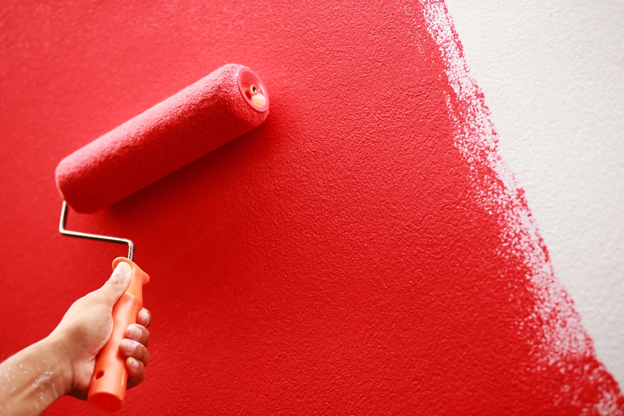
Red is a highly stimulating color that can evoke strong emotions such as excitement, intensity, and even anger. For a baby, whose nervous system is still developing, such a stimulating color could contribute to feelings of restlessness and irritability. Red can make it harder for babies to settle down and sleep, which is a crucial concern in a nursery.
Alternative: If you love red, use it sparingly in small accents (like toys or wall art) rather than as a dominant wall color.
2. Intense oranges
Like red, orange is a stimulating, warm color that can create feelings of excitement and energy. While orange can be cheerful and fun in specific spaces, it may be too overwhelming for a nursery, where a calm and restful atmosphere is ideal. The brightness of intense orange shades can also be visually overwhelming.
Alternative: Softer peach or coral tones are less intense but still warm and welcoming without being overstimulating.
3. Bright yellows
Although yellow is often associated with happiness and sunshine, bright or neon yellows can be overstimulating for infants. Studies suggest that babies tend to cry more in bright yellow rooms. Yellow reflects a lot of light, which can be visually straining and may prevent a baby from relaxing or sleeping well.
Alternative: If you want to use yellow, opt for soft, pale yellows, which offer warmth without the harshness of brighter tones.
4. Dark purples
Dark purples, such as eggplant or deep plum, can feel heavy and moody in a nursery. While these colors may be elegant in other areas of your home, they can create an overly somber atmosphere in a baby’s room. Babies thrive in spaces that feel light and bright, and dark purples may be too oppressive for that purpose.
Alternative: Lavender or soft lilac offers a much lighter, soothing feel while still giving you a touch of purple.
5. Deep or dark blues
While blue is generally a calming and peaceful color, extremely dark shades like navy or midnight blue can have the opposite effect in a nursery. They can make a room feel too cold or dim, which may create a less-than-inviting space for a baby. Dark blues also absorb light, potentially making a small nursery feel even smaller and more enclosed.
Alternative: Soft, muted blues, such as baby blue, pale sky blue, or soft aqua, provide the same calming effect in a much gentler, more uplifting way.
6. Sharp greens
Bright greens, particularly neon or lime green, can be too stimulating for a nursery environment. While green is a natural color often associated with growth and balance, excessively bright or sharp green hues can have an energizing effect that isn’t ideal for promoting sleep or relaxation.
Alternative: Muted sage greens, soft mint, or olive tones work much better for creating a peaceful, serene atmosphere in a nursery.
7. Grays (too dark or cold)
While gray has become popular in modern interior design, dark or very cool grays should generally be avoided in a nursery. These shades can feel too cold, dreary, and impersonal, especially in a space meant for nurturing and comfort. Gray lacks warmth and, if overused, can make a nursery feel less cozy.
Alternative: If you like neutral tones, opt for warm grays or greiges (a blend of gray and beige), which still provide a modern look but with more warmth and softness.
8. Black
Black, or any extremely dark hue close to black, is typically too harsh and dramatic for a nursery. It creates an oppressive atmosphere and absorbs light, potentially the room feel smaller, closed off, or even unsettling for a baby. Black doesn’t provide the soothing, nurturing feeling necessary for this space.
Alternative: Consider using black sparingly as an accent in patterns or designs, such as small wall art elements or furniture detailing. With moderate application, black can add a chic contrast to softer, lighter colors.
9. Overly contrasting colors
Sharp contrasts between bright colors (e.g., black and white stripes, neon pink, and bright green) can be overly stimulating for a baby’s developing eyes and brain. These high-contrast combinations can cause visual confusion and distract from a sense of calm. Contrasting colors are typically better suited for playrooms or areas where active engagement is encouraged.
Alternative: Stick to subtler contrasts with softer, complementary tones that create a harmonious flow. Gentle pastels and soft gradients between colors help create a nurturing environment.
10. Neon colors (in any shade)
Neon shades are overly intense and harsh for any nursery environment. Neon pinks, greens, blues, or yellows can be overly stimulating, causing eye strain and discomfort. These colors are often associated with energy and excitement, which might be ideal in a play area but not in a sleep-focused space like a nursery.
Alternative: Soft, pastel versions of these colors, such as pale pinks, gentle blues, or soft greens, will still allow you to incorporate your favorite hues but in a more baby-friendly way.
Additional considerations:
- Lighting impact: Consider how natural and artificial lighting interact with your chosen colors. Some colors, especially darker shades, can look even more intense or gloomy in rooms with limited light. Always test paint swatches at different times of the day.
- Balance of color: Even if you want to avoid specific colors as a primary choice, they can still work in small doses as accents in bedding, toys, or artwork. The key is not to overwhelm the room with deep or vivid colors.
Parting words
The goal in choosing nursery colors is to create a peaceful, calming environment where both baby and parents feel comfortable. Avoiding overly stimulating, dark, or harsh colors helps promote a restful and soothing space. Focus on soft, muted tones, light neutrals, and pastels to create a harmonious atmosphere that supports relaxation, sleep, and well-being.
Custom Painting, Inc. understands that since the nursery is where babies will spend most of their time, it needs the right environment for their development. If you struggle to find the perfect color for your baby’s nursery, consult our experts! Call us at 925-294-8062 or message us on our contact page for a free quote.